An Epic Design Fail
We’ve all experienced design fails. Sadly, they happen so often as to be unmemorable, not worth mentioning. Design fail examples include things like form controls not working, or confusing user interfaces, or problems with folding phones, or myriad other mobile phone design fails. But every now and then you encounter a design that fails so badly, that you just have to share it.
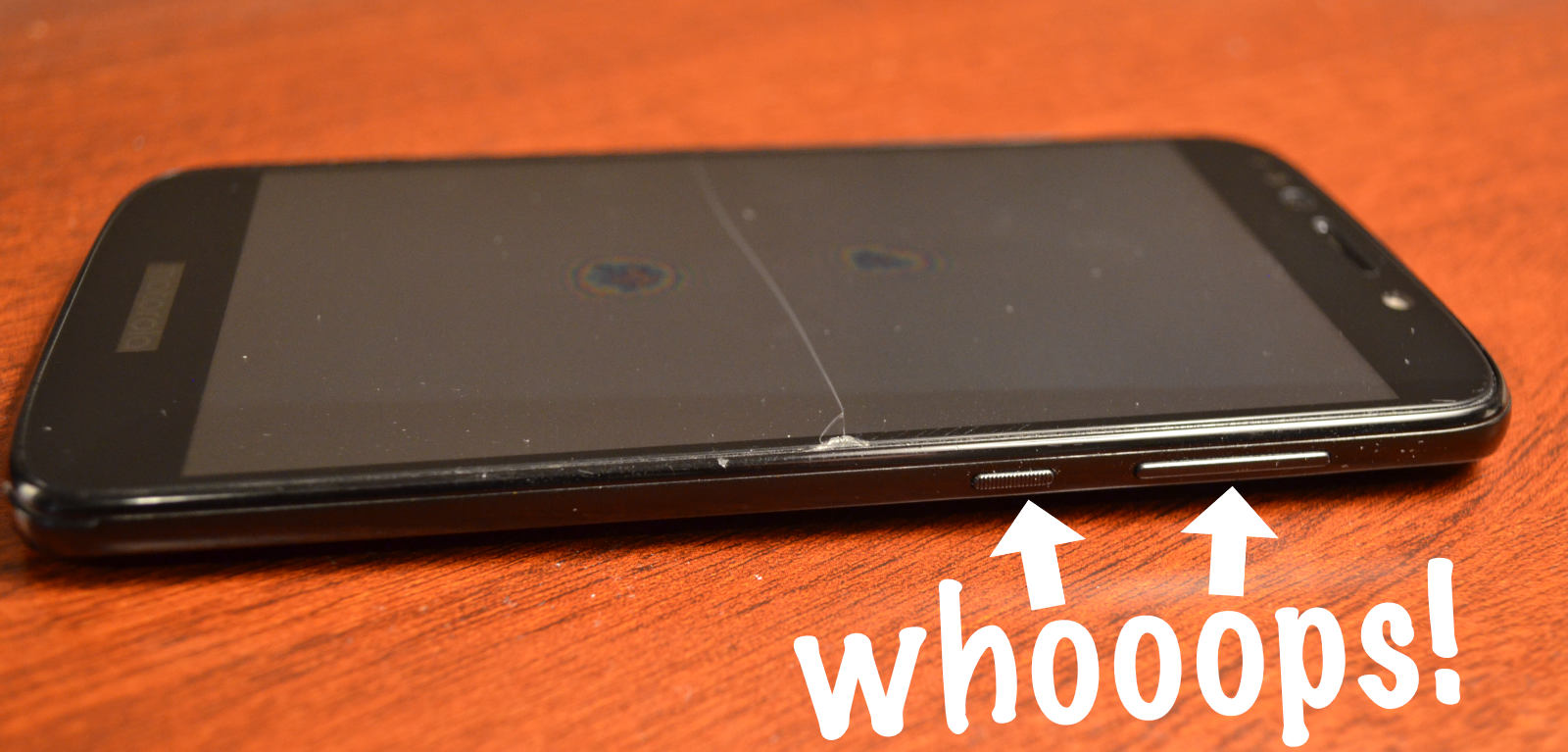
For the past 5 years Motorola phones ordered the volume and power buttons like:
That photo shows three different models:
- Moto G — 2015
- Moto X — 2017
- Moto e5 — 2019
So from 2015 to 2021, the volume bar was located beneath the power button. I never had to think about it. I knew the button locations intuitively. Change volume on the fly, without even looking. Power down no problem. How it should be.
Then in 2021, after six years of solid UI/UX design consistency, Motorola decided to change the order of the buttons. So now the volume bar is located above the power button. Not even joking:
Now that beautiful automatic intuitive experience is a confusing frustrating waste of time. Whenever I go to power down my phone, the volume cranks up. And when I go to lower the volume, the phone powers down. Fumbling with buttons thanks to Motorola’s epic design fail.


One response to “An Epic Design Fail”
I once had an LG G4 with volume buttons on the rear – non-standard but it worked very well. Returning to buttons on the side took a while.