Switching from Photoshop to Affinity Photo: Lessons Learned
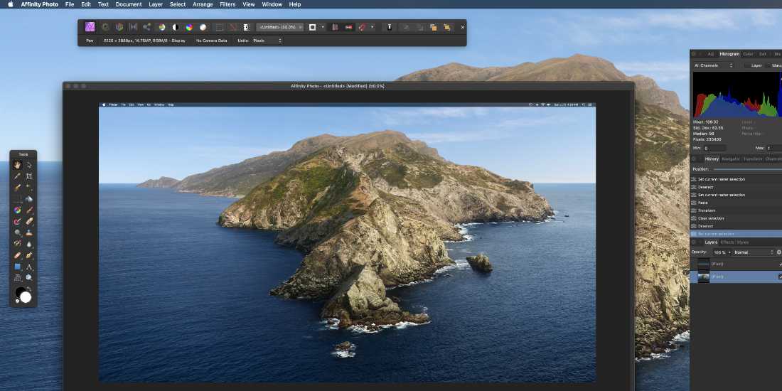
 This post is a bit different than my regular in-depth tutorials. This is where I scribble down notes and thoughts about my experience switching from Photoshop (PS) to Affinity Photo (AP). As I continue to learn AP and collect more notes, I’ll add them to this post. It’s an informal work in progress.
To give some context of where I’m coming from, I have around 20 years experience working with Photoshop (and other Adobe apps). Like many others, for me working in Photoshop is second nature, I don’t even think about it. After Adobe changed their pricing model to monthly/recurring charges (so it’s like renting instead of owning), I started looking for a good alternative, but could not find anything suitable until discovering Affinity Photo around six months ago. Affinity Photo sells as a one-time purchase, and a very affordable one at that.
Why I switched to Affinity Photo: Easy. It can do (most) everything that Photoshop can do for one payment instead of endless payments.
So what was my first impression of Affinity Photo six months ago?
Everything is different
Well not everything, but it took several months to learn the new software and adapt my workflow. For many, using Photoshop is just effortless. You don’t even have to think about it. So naturally switching to something new requires time, determination and patience. For long-time Photoshop users, that’s like THE big hurdle in switching: having to start at zero and relearn everything. Apart from the general layout of panels and menus, Affinity Photo’s UI/UX is much different than it is with Photoshop.
Some things are the same. Some things are missing. Some things are different. Some stuff is completely backward. All 100% worth it though because no monthly payments.
If you’re new to graphics work and have never used Photoshop, Affinity Photo will feel very intuitive. But if you’re coming over with years of experience working with Photoshop, there will be pain. It will take some time to reach the same efficiency levels with Affinity Photo.
Pros
As with any software-switching experience, there are pros and cons. Here are some notes from when I first got started with Affinity Photo (AP).
I prefer owning instead of renting.
Affinity Photo is a solid Photoshop alternative with no recurring payments. One-time purchase and you own the software. No monthly/yearly payments. No renting. And not just for Affinity Photo, but also Affinity Publisher to replace InDesign, and Affinity Designer to replace Illustrator. Now I’ve got everything I need without having to pay more $$$ every month.
I haven’t needed to go back to Photoshop for anything.
Affinity Photo is just as capable as Photoshop. For the graphic design work that I do, so far AP can do it all. I’ve not needed to use Photoshop for anything, and in fact did not even install it (or any Adobe products) on my new machine. I’m sure there are some deep features that I’m missing out on like “Puppet Warp” or whatever, but it doesn’t matter because I never use them.
Some things about AP are just way better than Photoshop.
While much of Affinity Photo works very similar to Photoshop, there are some features that are just way better. For example:
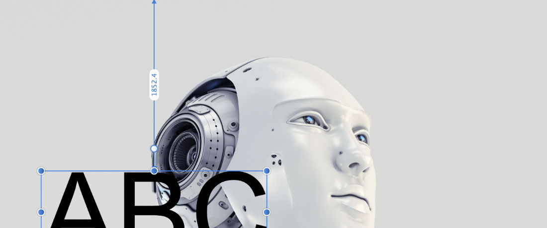
Centering and aligning layers. AP displays the distance (vertical and horizontal) as you nudge the layer, so you can be precise visually instead of relying on dragging a bunch of guides around like you have to do with Photoshop.
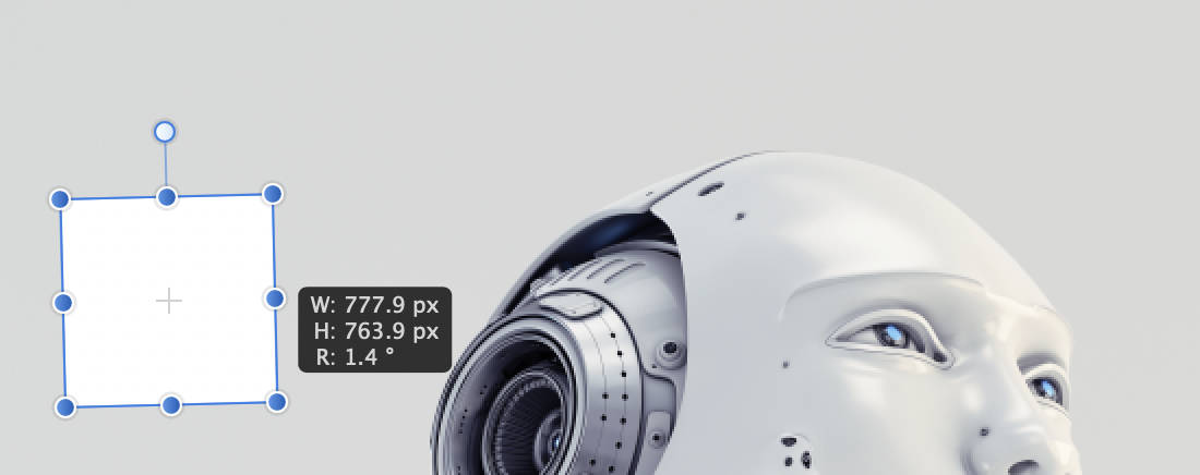
Likewise when adding shapes like rectangles and squares, the width and height are displayed in a little box so you can add shapes of specific size without extra clicks and fussing with guides. Just way easier.
Separated Mode. You gotta check out the option, Window ▸ “Separated Mode” is very cool, and an easy way to view all open documents and rearrange items as needed. One of my favorite AP features.
Other big pros..
Faster. On my machine, Affinity Photo loads up much faster than Photoshop.
Works offline. With Photoshop CS and beyond, you need to connect to the Adobe servers every 30 days to renew and update, etc. With Affinity Photo, you never need to go online for anything, unless you want to download the latest version and upgrade, etc.
No weird restrictions. Like with Photoshop CS there are limits like “one login one computer” so you can’t work across multiple devices (e.g., laptop, pad, mobile). With Affinity Photo, you can flow from computer to laptop to mobile without having to waste time logging in and out for every handoff.
No lockouts With Adobe you can get locked out of your account so you can’t use the software. I’ve heard reports of people getting locked out for 24 hours for stupid things like login issues or trying to use the software on multiple devices. With Affinity Photo, you never get locked out and always can use the software. Why? Because you own it. And aren’t chained to some account in order to use it.
No weird random advertisements
When you work with Adobe Photoshop, everything is routed through Adobe servers. That means Adobe can “serve” you advertisements whenever and however they would like. While you try to work, they will serve up a new panel resource, or some dialog popup, basically (not so) cleverly disguised ads that you have to click away like swatting flies. Not so with Affinity Photo. AP is standalone software that’s not routed through some third-party server somewhere. That means you can work in peace without having to deal with weird random ads.
PSD file format. Oh yeah, in case you were wondering, AP opens and handles .psd files perfectly. At the time of this writing AP can’t save new files in PSD format, but working with existing PSD files is no problem.
Cons
Fortunately, six months into learning Affinity Photo, I can find only a few real “cons” or downsides. I may discover more cons going forward, but for now here are the biggest things that need improvement:
- The Affinity documentation tends to be vague and unhelpful
- There is no way to save workspaces/layouts (HUGE downside)
- The whole “non-destructive” process thing is a waste of time
- Updated 2024 to add: blurry export files (still not fixed)
Let’s discuss each of these..
Affinity documentation needs help
The Affinity documentation is aimed at experienced users who know what everything is and where things are located. There are very few (if any) screenshots that actually show what things are and where to find them. Instead it’s just a bunch of abstract pedantic, Adobe-esque steps that look logical but tend to be unhelpful at best.
For the love of usability add some screenshots that actually SHOW what things are and where to find them.
As a new user reading through the documentation, I find myself asking “well what is that?” and “where is that located?” Seriously, “where is that, I can’t find it anywhere” type questions. The Affinity docs just assume way too much, like I have no idea where to find “The Something Tool” or whatever that’s just assumed common knowledge. I know one thing, it’s not in the same place as it has been for 20+ years working with Photoshop.
Fortunately, Affinity has a growing community and a healthy support forum, where you can find answers to specific questions, hunt for clues, and you know the drill. You’ll also find lots of other good resources when looking for answers about Affinity Photo when searching online. Lots of people getting on board and contributing their own findings, solutions, and tips.
One workspace for everyone
That sounds great, right? But in reality people have different workflows and love it when they can easily switch from one to another. With Photoshop, you can fine-tune a thousand different workspaces and save them all. And then you can switch to any of them as needed depending on the project or task. So utterly helpful and time-saving it’s beyond words.
With Photoshop, you get unlimited workspaces. With Affinity Photo you get one.
The ability to switch to a preset workspace that’s optimized for specific tasks helps save time and boost productivity. It’s just such a basic fundamental feature that apparently we’ve all been taking for granted. With Photoshop, you can switch to a predefined workspace for each project, and have it dialed it juuust right for optimized workflow. With Affinity Photo, you get one workspace and that’s it. The ol’ “one workspace for everyone” idea may sound like the most wonderful thing. But in reality it’s a missing feature.
Non-destructive workflows are a waste of time
The big thing I think that I don’t like about Affinity is the whole non-destructive editing process. I wish there were a way to disable it. It may be useful for some, but for others it’s just more work, requiring extra steps to the same job.
What is the point of a non-destructive workflow if it is less efficient than traditional workflow?
In Photoshop, when you edit a layer it is edited. In Affinity Photo, when you edit a layer you get another layer to use for the editing. The idea is to “protect” the original layer so you can return to it later if needed. So instead of YOU deciding when and where to duplicate a layer, the program enforces it as a rule. It’s just a waste of time aimed to help people are incapable of managing layers on their own.
Notable Differences
My day-to-day is BUSY. So when switching to Affinity Photo, it had to be “hit the ground running” to keep my work moving forward. Of course, the proper way to learn anything new is to read through the documentation. Maybe watch some training videos, or get lessons online somewhere. Maybe that’s how I should have done it. Instead I just jumped right in, fully expecting Affinity Photo to be very similar to Photoshop.
And delightfully, for the most part, AP is very similar to PS. But there were some stumbling blocks. Here is a working list of confusing and/or problematic differences between Affinity Photo and Photoshop. Along with any related workarounds or tips.
The little things..
- There is no way to set the default directory for exports
- Try creating a simple color gradient that fades into transparency lol
- No crop from selection; you have to copy, then go “New from clipboard”
- Cropping images is a chore, the crop tool is clunky, awkward and inaccurate
- Backgrounds are not transparent by default, you need to select “Transparent Background” when creating a new image
Some of these items are kind of a pain, but most I can live with. But there are some bigger differences and details that should be mentioned.
The bigger things..
Here are all the big issues and/or mysteries that need dealt with when switching from Photoshop to Affinity Photo. In no particular order.
- Images are all vector by default
- Screenshots and other images are vector-based (non-rasterized) by default. So if you try to select part of an image, then copy and paste, it won’t work. You need to click on the image layer and tell it to “rasterize” before you can copy from any selection.
- No “Save for Web”
- Affinity Photo provides nothing close to Photoshop’s awesome “Save for Web” feature. There are roundabout ways of sort of optimizing certain aspects of an image (like using the File ▸ Export feature). But the hot “one-stop shop” save-for-web sauce is not a current feature of AP.
- “Save as” limited to Affinity file format only
- Saving a file (e.g., File ▸ “Save As”) is limited. You can save only as
.afphotofile type. The only way to save a file in a specific format, like JPG, PNG, etc., is to create a new file using File ▸ “Export”. - Clipboard dimensions not utilized
- Like when you grab a screenshot of something you find on the Web, and want to paste it into Affinity Photo for editing, etc. In Photoshop, when pasting clipboard contents, the new document is automatically created with the same size. This does not happen with Affinity Photo. In AP, if you want the canvas to be the same size as the clipboard contents, you have to go to File ▸ “New from clipboard” (or press Shift+Option+Command+N).
- Switching between documents
- Switching between documents is a bit different in Affinity Photo. You can either go to View ▸ Views and select your document. Or you can click on the document’s tab (located below the context toolbar on top of the user interface).
- Getting the document dimensions
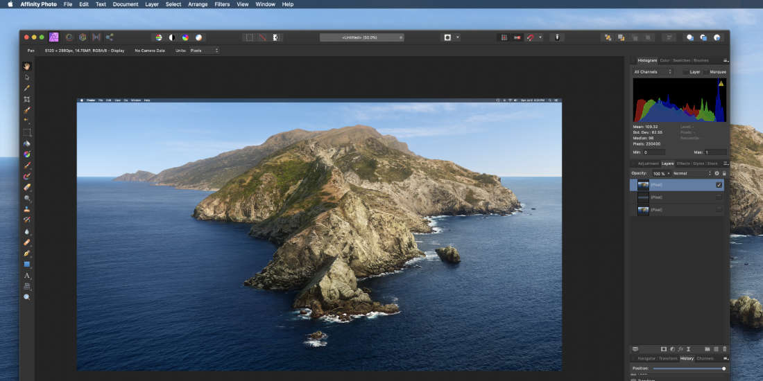
- In Photoshop, you go to the menu ▸ Image to get the document size. With Affinity Photo, you need to select the Hand tool and then look in the upper-left lower menu bar (context menu) to see the dimensions.
- Picking colors now a chore
- In Affinity Photo, selecting color from an image is way more complicated than it is with Photoshop. You can’t just choose a color from anywhere in the image and have it populate the color palette. Instead you have to use the “Color Picker” tool, and then click on the image to load the color into the “sample color” thing, and then from there you can click on the sample color thing to apply the color to the image. And it’s actually even more complicated than that, as there are related settings in the toolbar that determine how the color is chosen and applied, etc. And if those settings aren’t correct, the color picker won’t do what you need it to do. Very frustrating.
- Pastes the entire image instead of just the selected area
- In some cases (like with rasterized vectors) you can’t copy a part of the image and paste only that part into a new document. Instead it keeps the entire image and only displays the part you selected. Apparently there is no way to truly crop the image data so that there is nothing outside of canvas edge. Makes it very difficult to perform basic tasks like vertical and horizontal centering. Very confusing. Still trying to figure it out.
- Pasting screenshots just random
- With Affinity Photo, pasting screenshots into existing documents (like when layering a bunch of screenshots), the image placement is just totally random. In Photoshop you can grab screenshot after screenshot and paste them into a document they always will be aligned with the canvas edges. In AP it never does that; instead it just pastes screenshot in apparently random locations on the canvas. I think the position of the mouse/cursor has something to do with placement, haven’t solved this one yet.
- Shift-lock is backward
- For example, when resizing an image using the select tool. In Photoshop, you always pressed shift while resizing to keep/lock the aspect ratio. Simple enough. But for some reason Affinity Photo reverses it so its backward. If you resize and DON’T press shift, the ratio is locked. To change the ratio, press shift. Sure it makes more sense, but serious pain re-learning this basic Photoshop skill.
- Random empty documents
- For example, I spent an hour putting together 80px x 80px document that contained like 20 layers (icons for my projects). After exporting all the layers as PNG images, saved and closed the document. Then later when re-opened, the document showed nothing: just an empty canvas with nothing showing. All the layers were showing in the layers palette, but no content was displaying in the document window. I tried everything I could think of, then tried all of the Affinity Photo docs and forums, etc. Finally gave up, just consider it a (hopefully one-time) loss.
- Some images displayed super tiny
- This is a weird one. For some reason, certain images when opened are displayed super tiny, like way way way zoomed out. So the entire image appears like a dot on the screen. Not a deal-breaker because you can just zoom in as needed. But still very mysterious and frustrating to deal with.
Closing Thoughts
Since first putting together notes for this article, I am much further along in transitioning from Photoshop to Affinity Photo. Many of the things that I was confused about or frustrated over, as listed in the article, well.. now they make more sense. Rather than re-writing the article based on this new, more familiar perspective, I share it as-is.
I hope this helps some folks who are looking for a realistic alternative to Photoshop. Maybe thinking of making the switch from Photoshop to Affinity Photo. Yes there are lots of differences, pros and cons, but overall the experience is 100% worth it. After years with Photoshop, the process of re-learning how to edit graphics using Affinity Photo is challenging. But it’s also helping me to break out of my comfort zone, improve workflow, experiment with features and try new things.
I want to see Affinity succeed. Hopefully they don’t make the mistake of following Adobe’s monthly/recurring pricing model. Keep it one-time purchase always. Renting software is for the birds.

13 responses to “Switching from Photoshop to Affinity Photo: Lessons Learned”
I think a huge advantage here is the common/shared file format between Affinity’s Photo, Designer and Publisher apps. And considering how Adobe had altered the key commands of AI, PS, and ID over the years, once you master Affinity Photo, you’re pretty close to mastering Designer and Publish – assuming you need the full graphics suite. Thanks for the post.
Great points, very true. Thanks Kel.
How does AP photo editing stack up to PS (camera raw, healing brush, clone stamp, layer adjustments)? Do they have having like adobes sensei ai that does the content aware fills? I am guessing that path tool is the same?
Your little things would all be included as big things to me because of the annoyance level.
Losing all my work to a empty file is a deal breaker. Seriously…. has this happened more than 1 time?
Can AP open just about in graphic file type possible like PS? Sounds like exporting/saving to any graphic file type could be a near deal breaker.
Does AP handle lots of layers and keep same performance? How about file sizes?
Have you spent much time with Affinity Designer yet?
Would like to hear how it stacks up to illustrator. When you said everything in AP is vector unless you force it to raster makes me wonder about AD.
Do you create/edit pdfs? Or do you have a better solution then adobe acrobat?
We’ve both spent the same amount of time with adobe software. It would be very hard for me to throw all that knowledge about photoshop, illustrator and acrobat away and start with something brand new at this point.
Would love to hear your thoughts again in 6 months or so on the Affinity software.
No, the losing all of my work to an empty file has happened only once. I have no idea why, could have been program or user error. It’s now been over six months using AP and have no other issues like this. AP is a very solid program.
AP can open just about any file type that I’ve tried throwing at it. Export also can export to any file type just like PS, but as mentioned there is no “Save for Web” feature.
Lots of layers no problem, performance — I think — is better than PS. File sizes are about the same (comparing PSD to Affinity formats).
Have not yet spent a lot of time with Affinity Designer. Some though, and it’s very similar to Illustrator from what I’ve seen so far. Vectors are treated like vectors, for example.
For PDFs, I haven’t used Acrobat for years. In the past, I used either InDesign or any good standalone PDF app. As my plan is to get back into writing books, I will be learning Affinity Publisher deeply, and sharing my thoughts (similar to the above article).
Absolutely what I was thinking going into it (and/or realized after jumping in). One of the main points the article drives at, it takes some serious time up front to re-learn everything, but in the end it’s worth it and I haven’t looked back.
Definitely will post more about Affinity software going forward. Thanks for the feedback and questions, Brian.
I made the switch about a year ago as a replacement for PS Elements for the same reasons as you did.
With my needs being VERY basic this was a huge win for me. A few things were different and awkward but I quickly adapted. I’m just glad I did not have to resort to using GIMP. (Sorry GIMP fans) ;-)
LOL so true about GIMP.. tried it on several different occasions, never could get into it.
Interesting article.
Too bad Affinity doesn’t want to have a Linux version (in 2020, a Flatpak package allows to serve all distros, flavors & versions).
I would be delighted to have you opinion on PhotoGimp : https://github.com/Diolinux/PhotoGIMP
Hey PhotoGimp looks very useful. I’ve tried GIMP on several occasions but couldn’t really get into it. I think PhotoGimp would have improved the experience. Thanks for sharing.
If I just used Phototshop Jeff, I’d be with you. I have Affinity and it is overall a great program. But I also rely on the other products in the Adobe universe – Illustrator, Premeier Pro,, In Design, XD, etc. Given the breadth of the offerengs, and that they all work well, the monthly fee is not unreasonable. If there was a package that offered all those for one price, I’d definitely take a look but I don’t think there is anything close right now.
True enough. For the big three — Photoshop, Illustrator, and InDesign — Affinity offers a realistic alternative at a much better price. But they’re not gonna suit everybody or every project, I’ll admit. I use Final Cut for video, and there are million alternatives to XD. I guess the point is that there is no reason for anyone to feel stuck with Adobe and monthly/yearly payments. Things are opening up.
I think I switched to Affinity already two or three years ago after getting fed up with Adobe.
And yes, the transition was hard, sometimes I still struggle with things you mentioned in your post :)
Save for Web though can be done with the same shortcut as I used on PS (Cmd/Ctrl + Option/Alt + Shift + S), or at least that is how I always have done it.
I made the switch some years ago, after we got the jack of Adobe’s half rate business practices and even worse ‘hidden’ software installs. Never thought about going back and I really LOVE Designer… I use it at a 5:1 ration to AP.
Grabbed Publisher during their insane lockdown 50% sale, so now am happily fully covered and our machines are noticeably snappier without all of Adobe’s background apps that never seen to turn off.
I really, REALLY want to get off Photoshop and use Affinity Photo, but right off the bat, I can barely see the tools on the left side and I have to sidle up to the screen to pick one. I’ve tried to convince SERIF that this is a major failure of accessibility protocols and needs to be fixed, but all we get on the Forum is “It can’t be done.” Very frustrating to find that it’s impossible to fix something as basic as being able to see your tools.