Fix Weird Hover Border in WordPress 5.7 Admin Menu
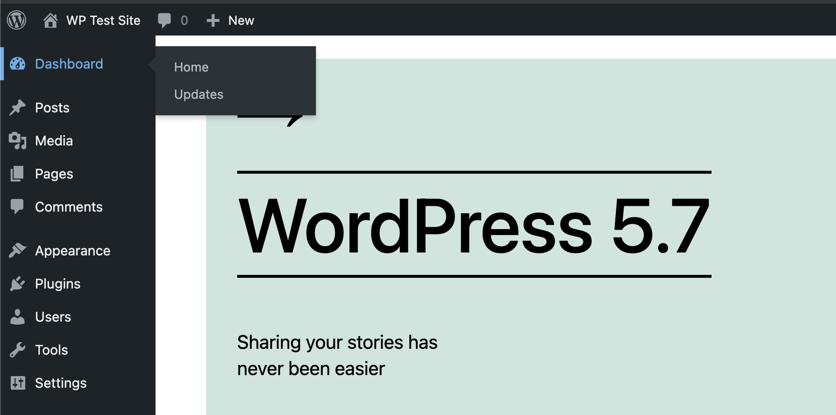
I’ve been testing the beta for WordPress 5.7. So far no complaints but there is one weird thing it looks like they are adding, some weird 4-pixel width border that displays when you hover over any item(s) on the main WordPress menu. It’s even got a transition animation to make it feel extra wonky. Here is a screenshot for those who have not yet had the pleasure of experiencing the new stylez (look on the left-hand side of the menu, blue border appears on hover for every menu item):
I have no idea why anyone would think this is a good idea or even necessary. Although obviously someone seems to think so. Honestly I don’t care. I just want to fix it, because it’s a clunky dumb feeling that distracts from normal menu navigation. You know, the menu navigation that’s been working great for years now, for millions and millions of users. I can’t roll my eyeballs hard enough here.
Better ways
Off the top of my head I can think of four ways that the hover/border accessibility “feature” could have been better implemented:
- Add an option on the User Profile screen, let the user decide
- Create a new super-contrasted “Admin Color Scheme”, let the user decide
- Actually increase the contrast of existing color scheme styles, not just add a wonky border animation
- Like so many other good WP things, make a plugin that can do it, then let the user decide to install or not
Why are these better? Because they are user first, not designer first. Always let the user decide, especially when it comes to the UI.
Code fix
So for anyone who wants to disable the new awkward side-border hover styles, just add this code to your theme (or child theme) functions.php file, or grab a copy of the same code as a simple plugin below.
// add style for wp menu
function shapeSpace_wp_menu_styles() {
	echo '<style>#adminmenu a:focus, #adminmenu a:hover, .folded #adminmenu .wp-submenu-head:hover { box-shadow: none !important; }</style>';
}
add_action('admin_head', 'shapeSpace_wp_menu_styles');
What is this code doing. It is adding a line of CSS to the Admin Area. The CSS simply removes the annoying 4px-width box-shadow that is responsible for displaying the odd side border. One rule and done.
Of course, there is no need to add the code manually if you would rather use a simple, free plugin to do the job..
Download plugin
To make life easier, you can download the above code solution as a simple plugin:
Install, activate, and say “hello” again to clean, unobtrusive menu navigation styles.


2 responses to “Fix Weird Hover Border in WordPress 5.7 Admin Menu”
Thank you Jeff. I’m wondering if perhaps they would have added this for accessibility reasons, maybe for extra contrast?
Yeah it probably is for something along those lines. Doesn’t change the fact that it’s super annoying and distracting.