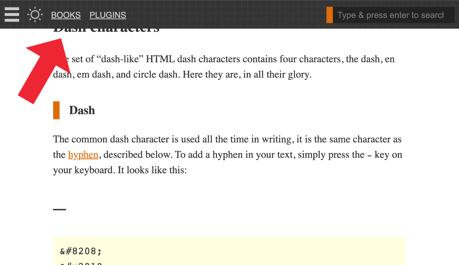
For sites using a fixed-position “sticky” header or similar, it’s necessary to add an offset margin to any on-page anchor targets. For example this recent article provides a Table of Contents menu with links to each section on the page. Click a link and the page scrolls down to the target element, which is an <h2></h2> heading tag. Thanks to one of the CSS solutions provided in this tutorial, the scrolling takes into account the page’s 50-pixel sticky header, so […] Continue reading »
I haven’t seen anyone mention this little CSS tip. All the proprietary vendor-specific placeholder rules now safely can be replaced with just ::placeholder. Seems very useful especially with the ever-increasing emphasis on site performance. The end result is less code and thus faster loading, better SEO and so forth. Continue reading »

I’ve always made use of CSS text-decoration properties in my theme designs and other dev work. From underlining text to making hyperlinks look great, text-decoration is essential CSS. Until recently I was not aware of a couple of related properties, text-underline-offset and text-underline-position. I am currently planning the next redesign of Perishable Press and thinking about using text-underline-offset to add some style to various link elements. So this post is to bring these related CSS properties together on paper, forever […] Continue reading »
![[ Scooby Doo Intro ]](https://perishablepress.com/wp/wp-content/images/2019/css-mystery-invisible-selection.jpg)
Recently I noticed a weird bug in my free WordPress security plugin, Banhammer. For some reason, I could not select any text on the page. Usually when you click and move the mouse cursor over some text, it becomes highlighted and displayed in some other color. But this wasn’t happening on the Banhammer settings screen. No matter which HTML/text I tried to select, it just wasn’t working. T’was a real mystery.. Continue reading »
While working on the site’s 24th redesign, I played around with a number of styles to customize the appearance of links. As you can see by hovering over any link, I decided to keep the styles as minimal as possible while still letting the user know that, “hey, this is a link”. This quick post shares one of the link styles I was considering, it’s sort of a “slide-up” background-color effect that happens when the user hovers over the hyperlink. Continue reading »
While working on the site’s 24th redesign, I ended up with about 10 code snippets that were awesome but ultimately not needed. So rather than just delete these tasty functions, I am posting them here for future reference. Who knows, during the next site update I may decide to implement or repurpose some of these techniques. And of course sharing is caring, so feel free to use any of these code snippets in your own projects. Check out the Table […] Continue reading »
![[ Clearfix Hack Evolution ]](https://perishablepress.com/wp/wp-content/images/2018/clearfix-evolution.jpg)
Is the clearfix method of clearing floats still useful? It’s been years now and I think the answer is “yes”. For example, I use clearfix to clear floats in the site’s current design. It’s the “cleanest” way to clear floated elements without setting widths, hiding overflow, or floating (nearly) everything. I know what some of you are thinking: “Cleanest..? Clearfix is a hack. A total nightmare event.” Years ago that may have been the case, but not so much anymore.. Continue reading »
![[ Screenshot: Unordered list wrapping against floated image ]](https://perishablepress.com/wp/wp-content/images/2013/css-list-float-01.jpg)
If you’re displaying floated images in your posts, you may notice that margins of lists and other block-level elements seem to “collapse”, as shown in this screenshot from the 2013 redesign: Continue reading »
![[ Screenshot: 3D Logo via CSS3 text-shadow ]](https://perishablepress.com/wp/wp-content/images/2012/3d-text-shadow-example.jpg)
Here’s a fun way to make text look 3D using CSS3. Using CSS whenever possible instead of images has several key advantages, including faster page-loads and better SEO I use the CSS text-shadow technique in a previous theme, and a few people had asked about it, so here it is: everything you need to create your own stunning 3D-text with CSS3.. Continue reading »
One of the joys of working with CSS is that you can basically write the code any way you want. Sure there are some basic rules you have to follow (like using brackets), but for the most part you can format your CSS code as elaborately or as plainly as you see fit. You can use this vast flexibility to improve the organization and usability of your working stylehseets before compressing them for production use. Continue reading »
When designing a website, it’s always a good idea to test on as many different platforms, devices, and browsers as possible. These days, pimping your websites for the iPhone and iPad is an important step in the design process. Especially on the iPad, sites tend to look about 20% cooler than on desktop browsers, so you definitely want to take the time to fine-tune the details. And when dealing with iDevices, it’s often necessary to deliver some custom CSS to […] Continue reading »
![[ Micro-Optimize Your CSS ]](https://perishablepress.com/wp/wp-content/images/2010/css-optimize/css-micro-optimize.jpg)
There are many ways to optimize your web pages. In addition to reducing HTTP requests and delivering compressed files, we can also minify code content. The easiest way to minify your CSS is to run it through an online code minifier, which automatically eliminates extraneous characters to reduce file size. Minification shrinks file size significantly, by as much as 30% or more (depending on input code). This size-reduction is the net result of numerous micro-optimization techniques applied to your stylesheet. […] Continue reading »
![long strings of text extend beyond the width of the pre box [ pre box with long URL extending beyond width ]](https://perishablepress.com/wp/wp-content/images/2010/wrap-pre/default-wrap.gif)
Quick tutorial post today. To wrap long URLs, strings of text, and other content, just apply this carefully crafted chunk of CSS code to any block-level element (e.g., perfect for <pre></pre> tags): pre { white-space: pre; /* CSS 2.0 */ white-space: pre-wrap; /* CSS 2.1 */ white-space: pre-line; /* CSS 3.0 */ white-space: -pre-wrap; /* Opera 4-6 */ white-space: -o-pre-wrap; /* Opera 7 */ white-space: -moz-pre-wrap; /* Mozilla */ white-space: -hp-pre-wrap; /* HP Printers */ word-wrap: break-word; /* IE 5+ […] Continue reading »
An excellent way to simplify and streamline your Cascading Style Sheets (CSS) is to take advantage of the many different shorthand properties available to you. Working with a lot of CSS, you eventually memorize these different shortcuts, but every now and then, I find myself needing a quick, straightforward reference for some of the more elaborate property combinations. In this post, I’ll show you the shorthand rules for the following properties: Continue reading »
![[ @font-face ]](https://perishablepress.com/wp/wp-content/images/2010/misc-chunks/css-font-face.png)
In my previous post on Quick and Easy CSS @font-face Code, I provide a choice set of CSS rules for embedding custom fonts into your web pages. It’s a solid, cross-browser technique that works great, but as Marty Thornley pointed out, it would be useful to have a more thorough explanation of how the code actually works. So, rather than going back and adding a bunch of additional information to the original post, I’m following up with a visual walkthrough […] Continue reading »
![[ @font-face ]](https://perishablepress.com/wp/wp-content/images/2010/misc-chunks/css-font-face.png)
I’ve been using custom fonts in my designs for quite a few sites now, and have refined what seems to be an ideal chunk of CSS code for implementing the @font-face rules. Some of the sites that include these rules include Perishable Press and Digging into WordPress, which look more stylish and refined with the custom fonts in effect. I’ve tested this code on quite a few browsers, including the following: Safari 3.1+ Opera 10+ Firefox 3.5+ Chrome 4.0+ Internet […] Continue reading »


![[ Scooby Doo Intro ]](https://perishablepress.com/wp/wp-content/images/2019/css-mystery-invisible-selection.jpg)
![[ Clearfix Hack Evolution ]](https://perishablepress.com/wp/wp-content/images/2018/clearfix-evolution.jpg)
![[ Screenshot: Unordered list wrapping against floated image ]](https://perishablepress.com/wp/wp-content/images/2013/css-list-float-01.jpg)
![[ Screenshot: 3D Logo via CSS3 text-shadow ]](https://perishablepress.com/wp/wp-content/images/2012/3d-text-shadow-example.jpg)
![[ Micro-Optimize Your CSS ]](https://perishablepress.com/wp/wp-content/images/2010/css-optimize/css-micro-optimize.jpg)
![long strings of text extend beyond the width of the pre box [ pre box with long URL extending beyond width ]](https://perishablepress.com/wp/wp-content/images/2010/wrap-pre/default-wrap.gif)
![[ @font-face ]](https://perishablepress.com/wp/wp-content/images/2010/misc-chunks/css-font-face.png)
