Margin Offset for Anchor Targets with CSS or JavaScript
For sites using a fixed-position “sticky” header or similar, it’s necessary to add an offset margin to any on-page anchor targets. For example this recent article provides a Table of Contents menu with links to each section on the page. Click a link and the page scrolls down to the target element, which is an <h2> heading tag. Thanks to one of the CSS solutions provided in this tutorial, the scrolling takes into account the page’s 50-pixel sticky header, so the heading text is fully visible on the page.
Contents
- Before applying offset
- After applying offset
- CSS Method 1: Use scroll-margin-top
- CSS Method 2: Add margin to target
- CSS Method 3: Add margin *before* target
- Method 4: Add margin using JavaScript or jQuery
Here are some “before” and “after” screenshots to help visualize the idea..
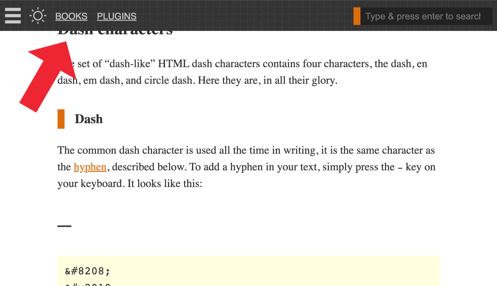
Before applying offset
Before applying an offset margin, the table-of-contents “jump links” scroll down to the default location. Because the page has a sticky header, the default position is not quite far enough. And the result is obscured heading text, covered by the sticky header, unreadable and awkward for the user.
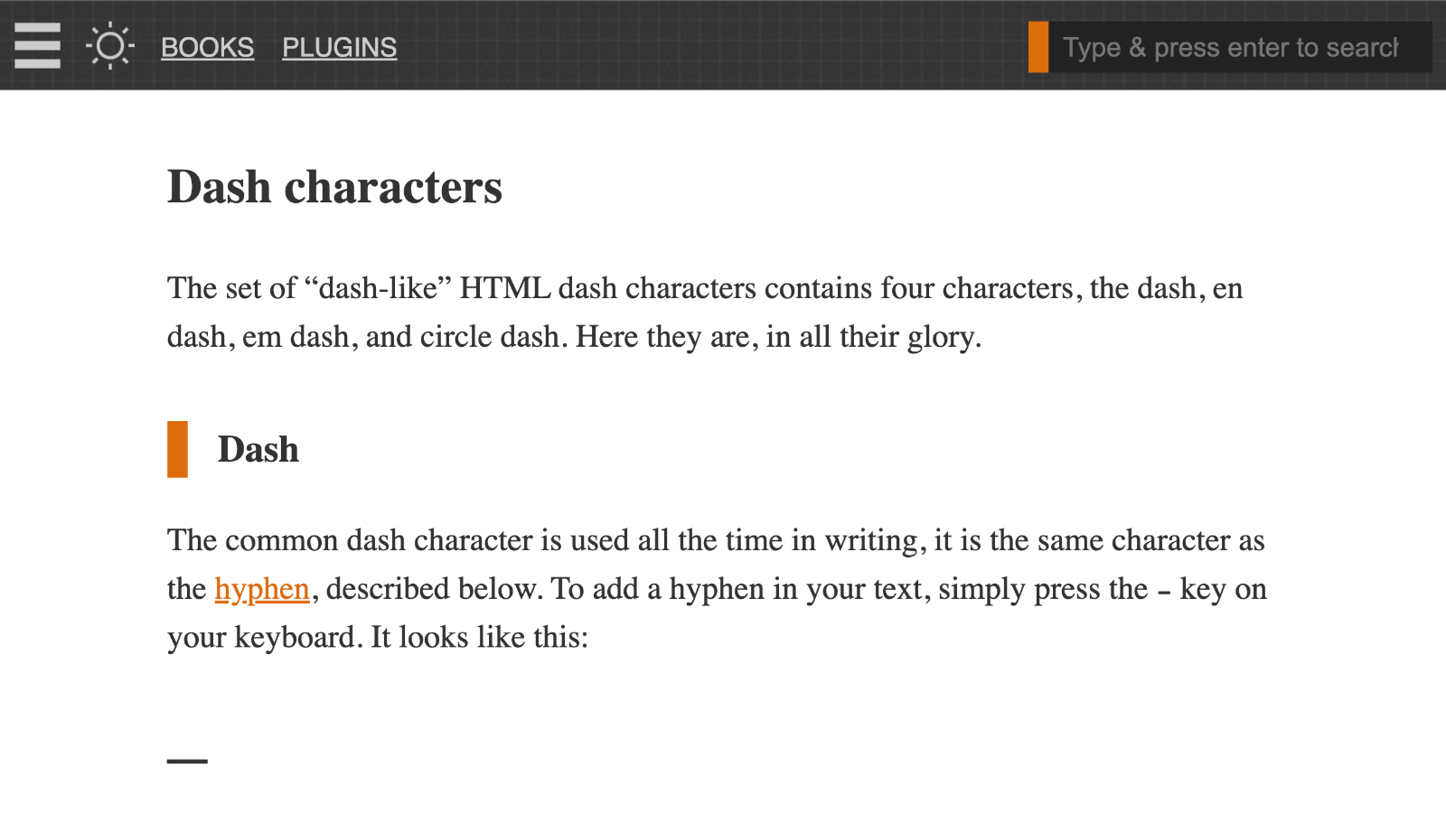
After applying offset
After applying an offset margin, the table-of-contents link scrolls down to the correct location. The extra margin added to the target element provides sufficient vertical space. So the heading text is displayed fully and looks good, etc.
You can try it out for yourself on any page with a table of contents (assuming the site’s current design still makes use of a sticky header). That’s the issue we’re solving in this tutorial. Here are four ways to add margin offsets for anchor targets.
CSS Method 1: Use scroll-margin-top
The simplest way to add offset margins is to use scroll-margin-top.
.target-element { scroll-margin-top: 50px; }Super simple and works on all major browsers (except of course IE). It’s not quite yet universally supported by all browsers, so if you’re going for 100% support, any of the other methods should get you there. Thanks to Dick Raney and this post over at CSS-Tricks for information about this technique.
Upside: Super simple and literally designed for adding offset margins.
Downside: Currently not as widely supported as other techniques.
CSS Method 2: Add margin to target
Another simple solution is to add the following line of CSS:
.target-element { margin-top: -50px; padding-top: 50px; }You’ll want to change the 50px to match the desired offset distance. For example, if the sticky header height is 90px, you’ll want to change the 50px to 100px or more. For best results, both margin and padding values should be the same. Whatever is needed to give plenty of vertical space for the target element to display properly.
Upside: Super simple and lightweight technique.
Downside: Doesn’t work with all layouts, watch out for floats and borders.
CSS Method 3: Add margin *before* target
The next best solution is to add the following line of CSS:
:target::before { content: ''; display: block; height: 50px; margin: -50px 0 0 0; }As before, change the 50px to match the desired offset distance. For best results, both margin and padding values should be the same. Whatever is needed to give plenty of vertical space for the target element to display properly. This is the technique used here at Perishable Press (current theme/design).
Upside: Simple, lightweight and gracefully degrading.
Downside: None, but be careful if the target element has any visible border. For example, border-left: 10px solid #DD6D0B.
Method 4: Add margin using JavaScript or jQuery
JavaScript
As you might suspect, margin offsets also can be applied using a bit of jQuery or JavaScript. First, here is the vanilla JavaScript technique:
window.addEventListener('hashchange', offsetAnchor);
window.setTimeout(offsetAnchor, 1);
function offsetAnchor() {
	if (location.hash.length !== 0) {
		window.scrollTo(window.scrollX, window.scrollY - 50);
	}
}
The beauty of this technique is that it just works. Simply add to your site’s CSS and done. Of course, you may need to change the 50 (pixels) to whatever is required.
jQuery
Here is how to implement using a few lines of jQuery:
var offset = $(':target').offset();
var scrollto = offset.top - 50; // minus fixed header height
$('html, body').animate({ scrollTop:scrollto }, 0);
Same as before, change the 50 to whatever suits your design.
Upside: Using JavaScript/jQuery separates behavior from appearance.
Downside: Heavy handed for something easily done with simple CSS.
That’s all folks, thanks for reading.


2 responses to “Margin Offset for Anchor Targets with CSS or JavaScript”
What about this CSS technique?
https://css-tricks.com/fixed-headers-and-jump-links-the-solution-is-scroll-margin-top/
Nice! Will add it to the article. Thank you :)