According to specification (and these helpful posts by Chris Coyier), CSS pseudo elements like ::before and ::after should be written with two preceding colons. It can be confusing because while pseudo elements are prefixed by two colons, like ::element, pseudo selectors (aka pseudo classes) are prefixed by only one, like :selector. So that’s the context for an odd little CSS bug.. Continue reading »
While working on the site’s 24th redesign, my goal was to simplify the UI as much as possible. As much as I enjoy lots of cool effects, I wanted the new design to be as minimalist as possible. So that meant dropping a LOT of little bells and whistles that were included in the previous design. One feature that didn’t make the cut was smooth scrolling to internal anchor targets. Like when you click a link that takes you #somewhere […] Continue reading »
While working on the site’s 24th redesign, I played around with a number of styles to customize the appearance of links. As you can see by hovering over any link, I decided to keep the styles as minimal as possible while still letting the user know that, “hey, this is a link”. This quick post shares one of the link styles I was considering, it’s sort of a “slide-up” background-color effect that happens when the user hovers over the hyperlink. Continue reading »

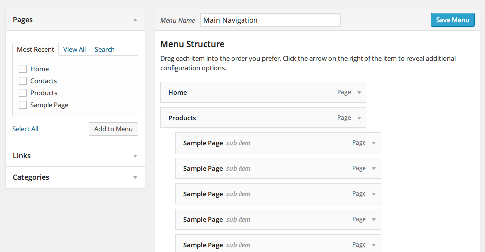
In this tutorial I am going to show you how to build a pure CSS drop down menu in WordPress. I will walk you through the steps of creating a menu in WordPress, customizing it with CSS, and then printing the menu in your theme file. This tutorial requires that you have access to edit your WordPress theme files and also a basic understanding of HTML and CSS. I will walk through the process step-by-step so don’t worry if you […] Continue reading »
After implementing Chris Coyier’s More Sidebar technique here at Perishable Press, I needed a good source of “filler” content for the “more” blocks. After experimenting with multiple loops and template tags, the idea of sliding in RSS feeds seemed like a better solution. Replacing some empty space with great content is a win-win for everyone. For example, I display a few of my recent tweets in the sidebar to help fill a lil’ space. It’s a great way to share […] Continue reading »
![[ Twitter Bird ]](https://perishablepress.com/wp/wp-content/images/2011/twitter-bird.png)
My previous theme displays my latest tweet at the top of every page. It turned out to be an excellent technique for getting more followers – visitors see the tweet, click the link, and possibly follow me on Twitter. There is even a cookie-powered “Hide” link for uninterested visitors to hide the tweet for awhile. I received quite a few requests for a tutorial on the technique, so here is how to display your latest tweet with show/hide cookies. For […] Continue reading »
Preloading images is a great way to improve the user experience. When images are preloaded in the browser, the visitor can surf around your site and enjoy extremely faster loading times. This is especially beneficial for photo galleries and other image-heavy sites where you want to deliver the goods as quickly and seamlessly as possible. Preloading images definitely helps users without broadband enjoy a better experience when viewing your content. In this article, we’ll explore three different preloading techniques to […] Continue reading »
For my Serious redesign, I push the envelope in terms of CSS’ advanced selector functionality. Stuff like: p:first-child p:first-child:first-letter p:first-child:after p:first-child:first-line Plus lots of other stylistic tricks that require CSS3 support in order to display as intended. Fortunately, most of the browsers to which I am catering with this new design have no problems with most of the advanced stuff. Of course, Internet Explorer chokes on just about everything, but fortunately IE’s proprietary conditional comments make it easy to fix […] Continue reading »
If you operate a website that features lots of code examples, you know how important it is to spend some quality time styling the <pre></pre> element. When left unstyled, wild <pre></pre> tags will mangle your preformatted content and destroy your site’s layout. Different browsers treat the <pre></pre> tag quite differently, varying greatly in their default handling of font-sizing, scrollbar-rendering, and word-wrapping. Indeed, getting your preformatted code to look consistent, usable, and stylish across browsers is no easy task, but it […] Continue reading »
![[ Screenshot: Example Photo Styled with swfIR ]](https://perishablepress.com/wp/wp-content/images/2008/misc-chunks/swfir-example.png)
In this ultimate guide to swfIR, you will learn how to use swfIR to replace your ordinary images with richer, stylized graphics. swfIR enables efficient, practical and scalable application of drop-shadows, rounded corners, and even image rotation to any number of specified images throughout your site. From concept and application to examples and recipes, this guide covers everything you need for successful swfIR implementation. The Challenge.. There are many ways to enhance the visual presentation of your images. Popular visual […] Continue reading »
While we all watch as Internet Explorer 6 dies a slow, painful death, many unfortunate designers and developers continue to find themselves dealing with IE6’s lack of support for simple things like minimum and maximum widths. Fortunately, there are solutions to this problem, primarily in the form of CSS expressions such as this: /* set the minimum width for IE 6 */ #target_element { width: expression((document.body.clientWidth < 335)? "333px" : "auto"); /* min-width for IE6 */ min-width: 333px; /* min-width […] Continue reading »
Recently, I have been getting a lot of requests for multiple-loop configurations in WordPress. It seems that multiple-column, multiple-loop configurations are in high demand these days, especially ones that display posts like this: First column, first loop: display posts #1-5 Second column, second loop: display posts #6-10 Third column, third loop: display posts #11-15 Using WordPress and a little CSS, this configuration is relatively easy to accomplish. Let’s cut right to the chase.. Continue reading »
![[ Diagram: Default WordPress Post Display Order ]](https://perishablepress.com/wp/wp-content/images/2008/horiz-order/horizontal-order_default.gif)
Most WordPress-powered blogs display posts in sequential order within a single column. Like this, for example: Continue reading »
![[ Count Chimpula ]](https://perishablepress.com/wp/wp-content/images/2008/misc-chunks/verify-feedcount.jpg)
Recently, I received a bizarre email accusing me of calling someone out on their fake Feedburner subscriber count. Apparently, some desperate blogger had been claiming to have something like 30,000 Feedburner subscribers when in reality they only had around 700. From what I could tell, the fraudulent site was displaying a counterfeit Feedburner subscriber-count badge using some fancy CSS image-replacement or something. Whatever. I really could care less, but the information contained in the email got me thinking: Providing an […] Continue reading »
![[ Jump Menu ]](https://perishablepress.com/wp/wp-content/images/2008/jump-menu/access-deco.jpg)
Recently, a reader named Don asked about this theme’s accessibility (accesskey) jump menu located at the top of each page. Several people have commented that they like the way the jump menu “lights up” upon gaining focus. Whenever a user hovers their cursor over the region at the top of the page, all links in the jump menu change to a more visible color. Then, as the cursor moves over the various menu items, each jump link is further highlighted […] Continue reading »
Want to make sure that your feeds are not indexed by Google and other compliant search engines? Add the following code to the channel element of your XML-based (RSS, etc.) feeds: <xhtml:meta xmlns:xhtml="http://www.w3.org/1999/xhtml" name="robots" content="noindex"></xhtml:meta> Here is an example of how I use this tag for Perishable Press feeds (vertical spacing added for emphasis): Continue reading »


![[ Twitter Bird ]](https://perishablepress.com/wp/wp-content/images/2011/twitter-bird.png)
![[ Screenshot: Example Photo Styled with swfIR ]](https://perishablepress.com/wp/wp-content/images/2008/misc-chunks/swfir-example.png)
![[ Diagram: Default WordPress Post Display Order ]](https://perishablepress.com/wp/wp-content/images/2008/horiz-order/horizontal-order_default.gif)
![[ Count Chimpula ]](https://perishablepress.com/wp/wp-content/images/2008/misc-chunks/verify-feedcount.jpg)
![[ Jump Menu ]](https://perishablepress.com/wp/wp-content/images/2008/jump-menu/access-deco.jpg)
