When designing on the grid, there are numerous ways to check that elements are properly aligned. For example, when working with xy.css the visual matrix lets you “see” how elements are lining up (or not) with the grid.
You can see an example of the visual matrix by clicking the “show matrix” button in the upper-right corner of the page. Once you do so, the visual matrix will be clearly visible, making it easy to see how elements appearing above the fold (i.e., the top of the page) align with the grid. Checking check the grid below the fold, however, requires a bit more effort.
Scroll down
The easiest way to explain things is with some screenshots. First there’s the typical case, in which the bottom edge of the browser window is not aligned with the grid. Here is an example of xy.css in Chrome:
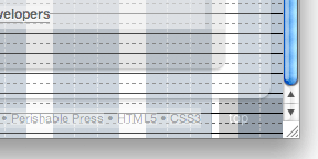
Looking carefully at this image, we see that the bottom edges of the page elements appear to be misaligned with the vertical grid. This is because the innermost bottom-edge of the browser window determines the lowest point on the page, which will break the grid if misaligned (as seen in the screenshot).
Line up
So to check or verify that the grid is maintained throughout the length of the page, the trick is to align that innermost bottom-edge of the browser window with the vertical grid, as seen here (again xy.css on Chrome):
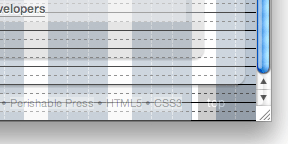
As you can see, the scrollbar is at its lowest point and the browser edge is positioned beneath an arbitrary grid unit. As expected, this browser alignment enables the page elements to re-align with the vertical grid.
One pixel
Quick note about that “innermost” bottom-edge referred to previously: the bottom few pixels of each browser’s UX are unique, so it can take some fiddling to find the “innermost” edge. For example, in Chrome, the bottom edge of the browser consists of a 1-pixel black border followed by a gradient. The 1-pixel border is the innermost edge, so that’s what needs aligned beneath the nearest grid unit.
Positioning the browser edge “beneath” the nearest grid unit ensures that the browser window contains a whole number of grid units, without any leftover pixels to break the grid. For example, positioning the bottom edge at instead of beneath the nearest grid unit will break the grid:
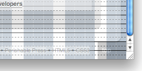
As mentioned, each browser’s UX is different, but it’s only the innermost edge that’s important for checking the bottom of the page. Line that up beneath the nearest grid unit and you’re good to go.
No slack
One more note about checking the grid beneath the fold: make sure to scroll all the way down to remove any slack from the scrollbar. Even when the bottom edge is aligned properly, the grid can break if the page isn’t scrolled all the way down, as seen here:
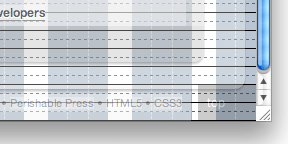
Notice how the bottom edge is positioned properly beneath the nearest grid unit, but the grid breaks because of the slack in the scrollbar. Scrolling down completely removing all slack puts things back on the grid:

Comments
Comments are closed.